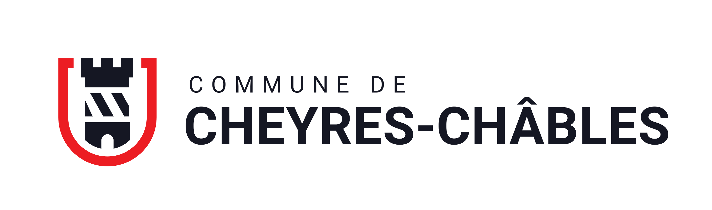
Municipality · Visual identity
A modern identity for the municipality born from the merger of Cheyres and Châbles: a logo, three colours and brand guidelines that the administration applies on its own.

The context
Two villages, a single municipality since 2017, and materials that still placed the legacies of each side next to one another. It needed a shared image, one in which the inhabitants of both villages could recognise themselves.
What we did
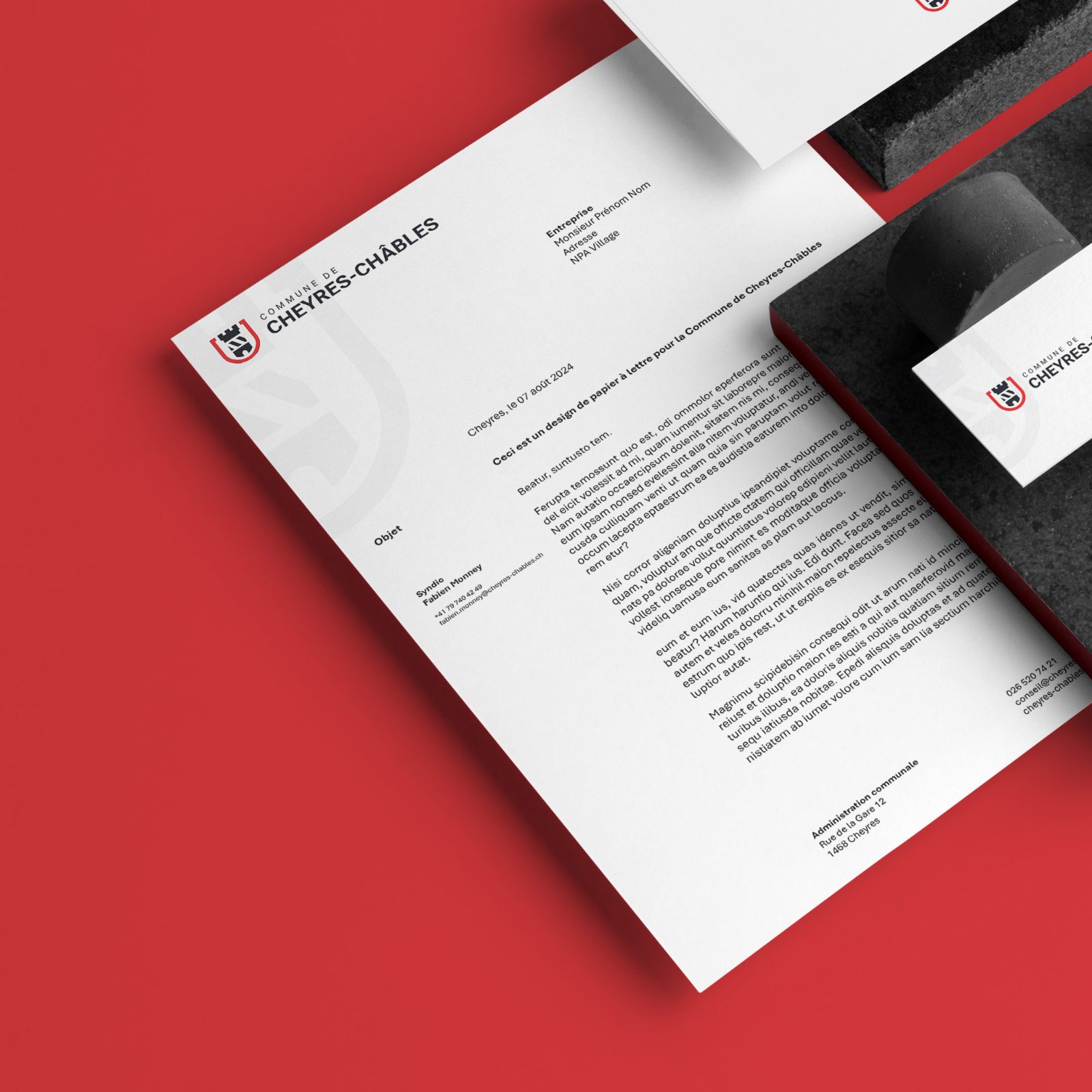
Listening work with the authorities, then a coat of arms redrawn from the shared elements: the tower, the stripes, the red. Around it, a complete system: colours, typography, pattern, stationery, social media and brand guidelines.
The result
Challenges and objectives
Two villages, two histories: each must find its own in the new coat of arms.
Materials inherited from both sides that didn’t look alike. It needed a single image, everywhere.
A municipality doesn’t change its logo every five years. The identity has to age well.
The know-how
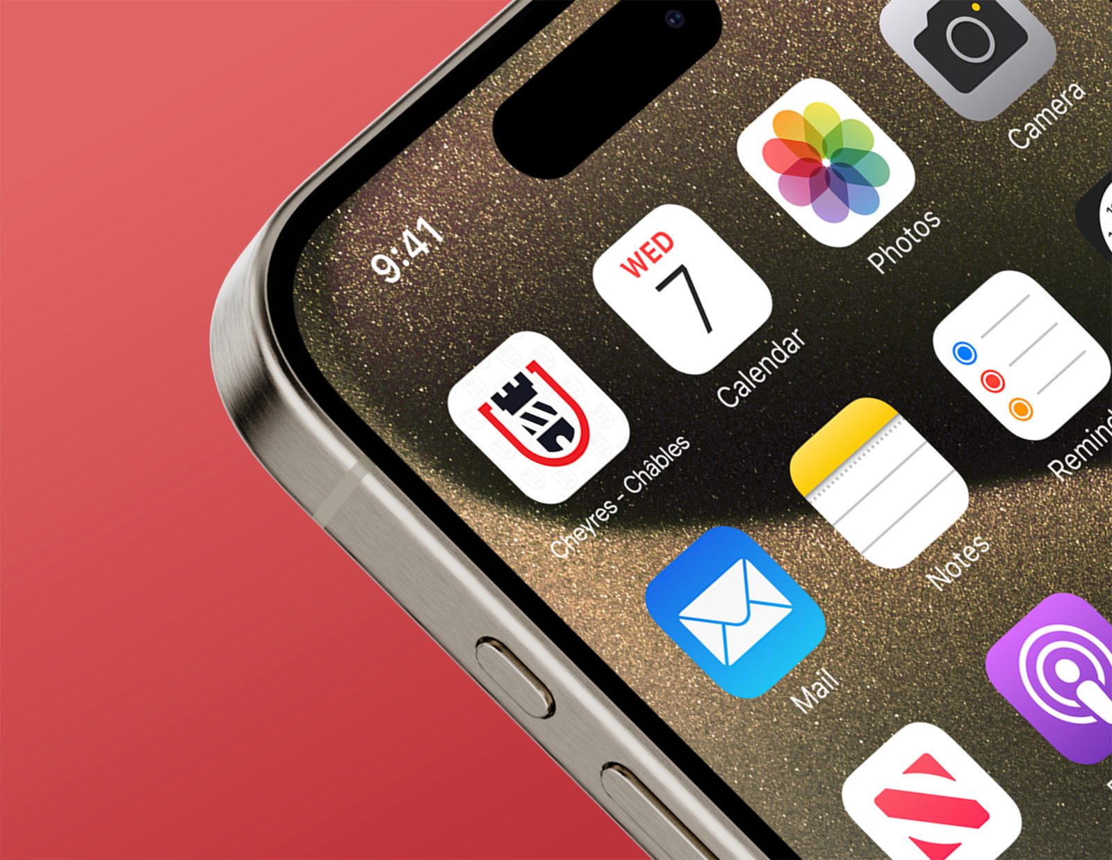
The tower, the stripes and the red stay, reduced to the essentials: the symbol reads on a sign as well as on an app icon.
Strategy · listening and diagnosis02Structure a systemColours, typography, pattern, applications: every item follows the same rules. Everything looks alike, effortlessly.
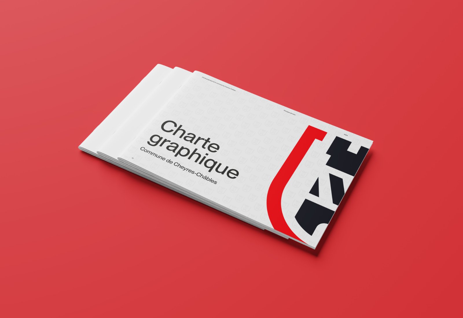
Graphic design · visual identity03Hand over the toolsClear guidelines and templates ready to fill in. The administration produces its letters and publications without coming back to us.
Guidelines and templatesThe starting point
The project: a new visual identity for the municipality, a logo and brand guidelines based on the existing coats of arms. We had to start from its history: two coats of arms, then a shared one.
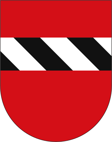
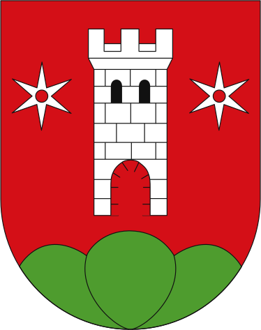
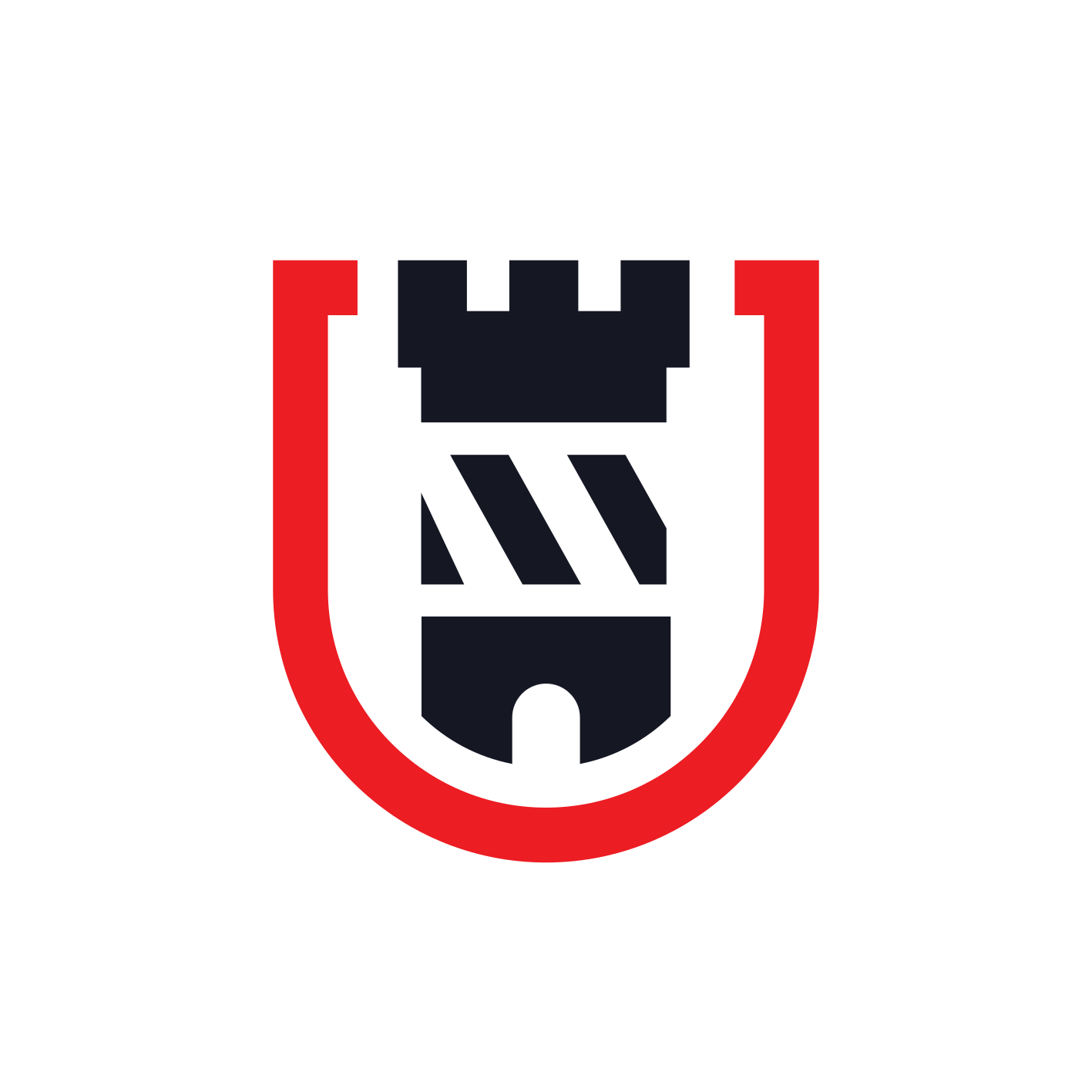
Each with its own coat of arms: the stripes of Cheyres, the tower and the stars of Châbles.
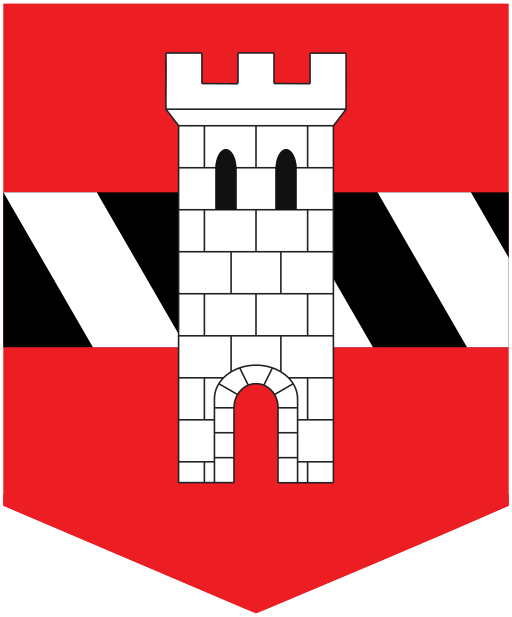
The two municipalities become one. The coat of arms places the tower of Châbles on the stripes of Cheyres.
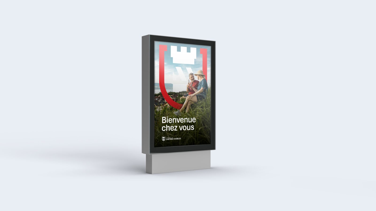
Same tower, same stripes, same colours. A simplified drawing, legible on a screen as on a sign.
The system
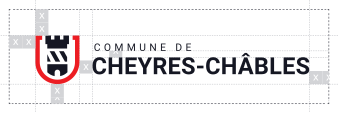
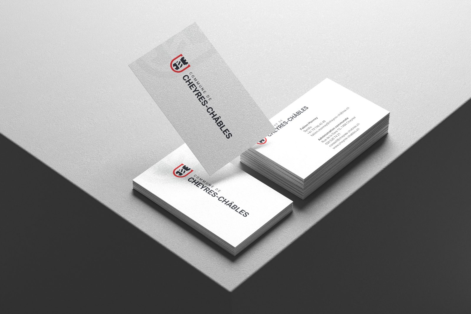
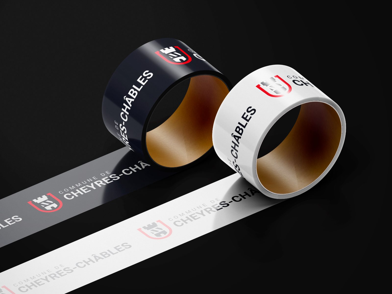
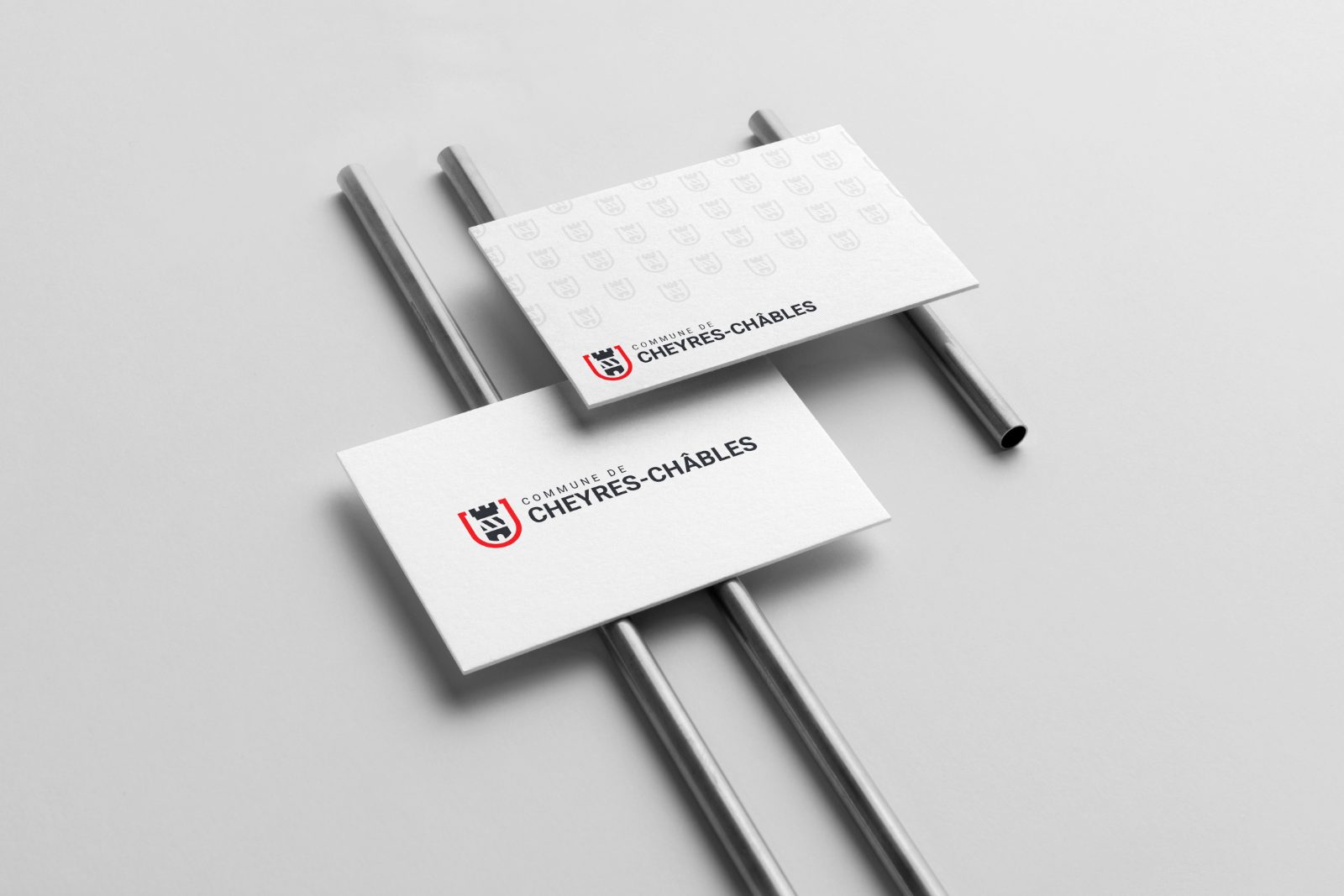
The symbol alone for small formats, the full logo for the rest. Red, black and white, and nothing else: the identity fits in three colours.
In use
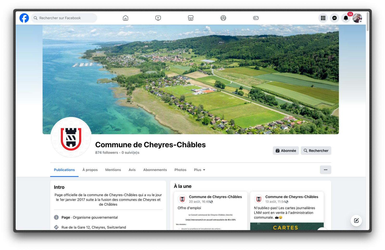
Stationery, signage, social media, app: the same identity wherever the municipality speaks to its inhabitants.
The modernisation of our identity was welcomed very positively by the inhabitants. A clear design, simple to use and respectful of our heritage.Commune de Cheyres-ChâblesMunicipal authorities
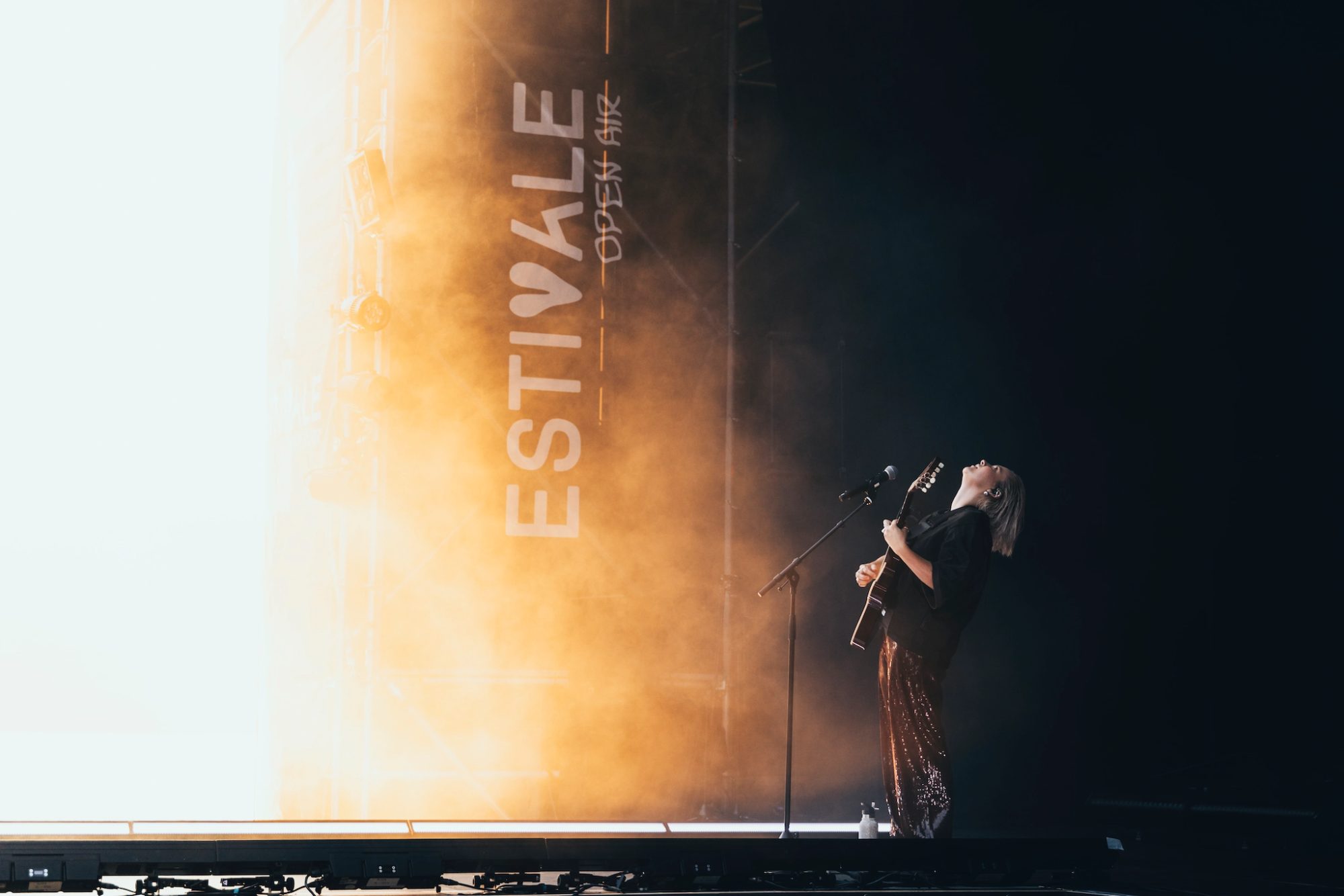
Official photographers since 2021: four days, seven facets of the festival, everything sent for approval the same evening.
A municipality, an association, an SME?
30 minutes, no commitment. We look together at your current materials, and at what a clear identity would change for your inhabitants or your clients.